Friday, November 27, 2009

The Tiger and The Dragon - v. 2.0

So I finally finished the tiger and the dragon tattoo and I have to say, I'm SO proud of how it turned out.

It took me a while to finish it, because I was very intimidated by both animals and because I don't often draw and paint animals. But this piece needed to be AMAZING.
AND SO. Here it is finished, in all it's beautiful and colorful glory.
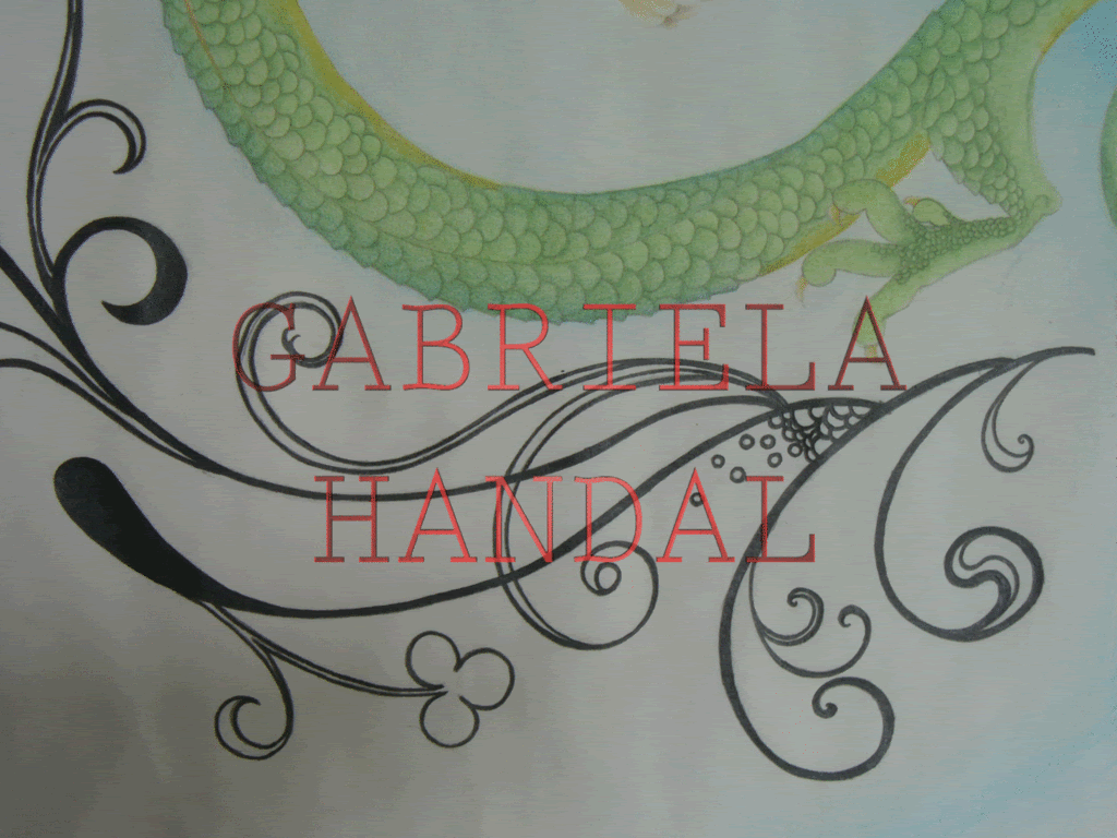
As you remember in the previous journal entry that I talked about this commission, it was very bland and the floral designs in the background were very bold and I had no intention of changing them really, but they also looked so stiff and not flowing in comparison to the ones the owner wanted.

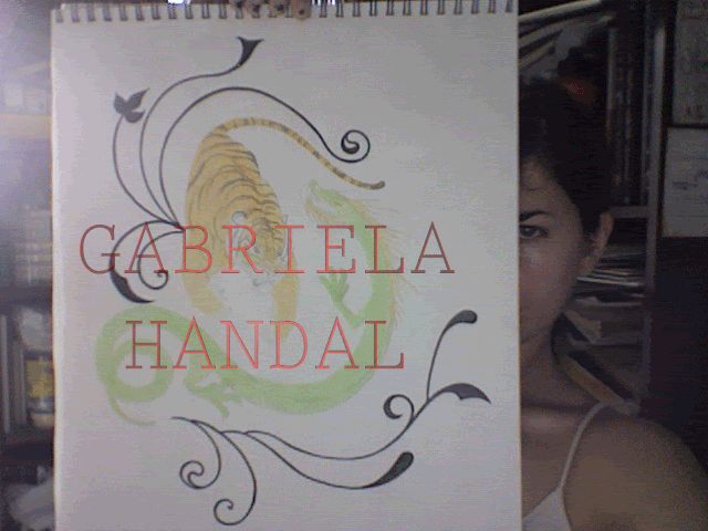
And both animals looked good, but I was taking it real slow with them, because I didn't want to mess them up.
So, I layered the colors and painted them both real slow and thinking about it long and hard, as I advanced. And also, something I wanted to add was some sort of blue background. I just felt as though, it would look so much more rich and it would go very well with all the other colors that are present.
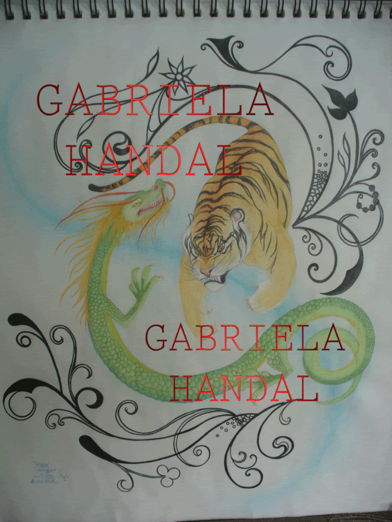
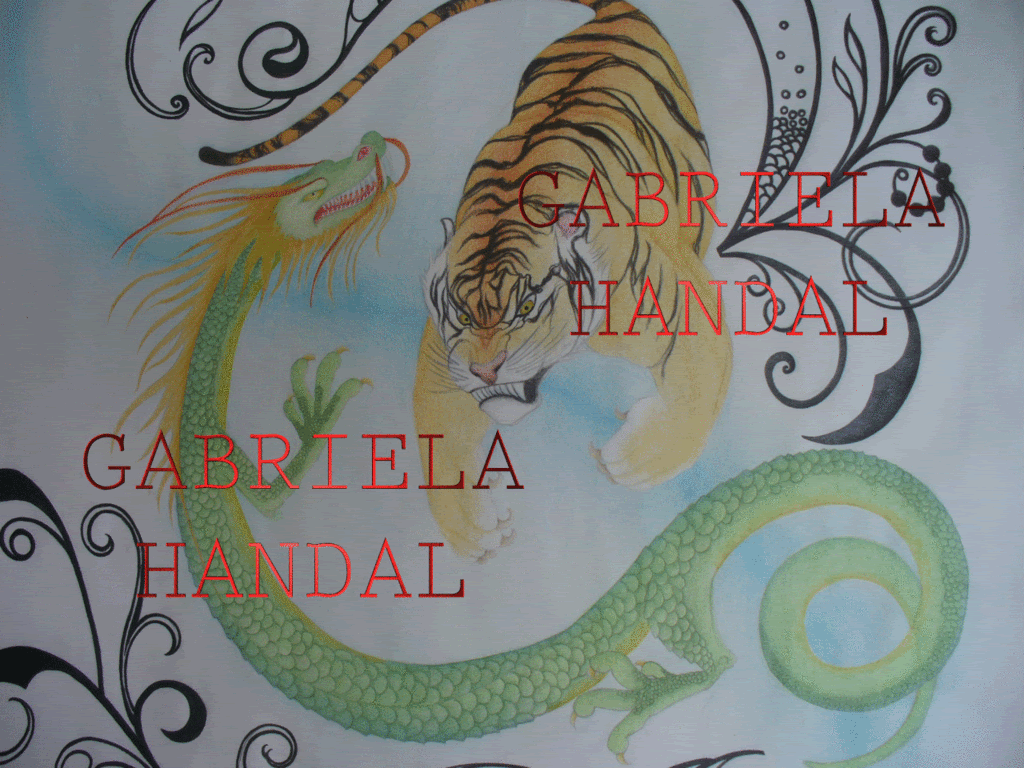
As I was finishing them and as I worked on them I see how their images and their physique also reflect their personalities and the fighting style they're meant to represent:
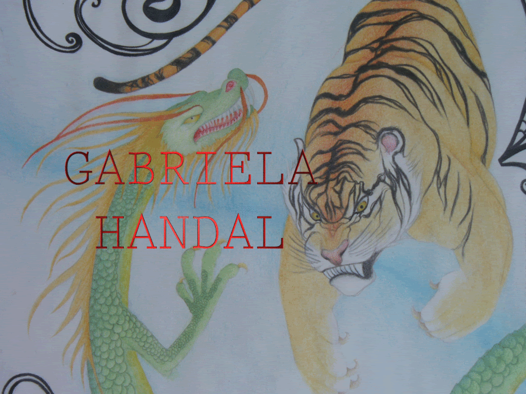
- The tiger has really bold colors, not that much detail and is looking straight at the spot in the dragon's body that he's going to attack. This is consonant with his instinctive and gutsy personality and how his fighting style is more about brute strength, rather than strategy and elegance.
- The dragon has many more colors and detail about him, long thin body and limbs. Easily is going around the tiger's attack. This is consonant with the delicacy that he is meant to represent, how his personality and fighting style are more about wisdom, patience and planning.
Also, the black designs I was asked to put around them, they're nature, which surrounds them as their fight goes on. A fight of extremes must take place in a neutral setting.
And the blue that I wanted to add, I wanted to make it something that was flowing in between the both of them and it ended up looking like the "S" shape that divides the Ying Yang, so it's present after all XD

Some pictures of close ups and details =D


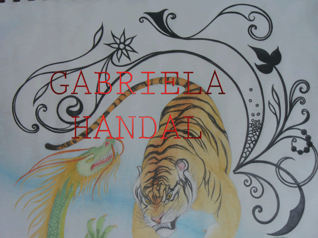
And there you have it! The tiger and the dragon looking beautiful and amazing. Last night, the owner came to pick them up and she liked them very much, too! A successful sale and piece.
I'm SO proud of myself!

Remember about the group and fan page in facebook, you NEED to join and become a fan, invite other people, leave me comments and look at my work and, when I figure out how, buy me something.
Thanks for reading! <3 ^______^
- Join my group in facebook Gabriela Handal Arte, and invite other people!
- Become a fan in facebook Gabriela Handal Arte and invite other people, too!

http://condron.us/

Monday, November 16, 2009

A fairy and an Alien

Before I start, I just want to point out that I don't know why the colors came out so bright after the scan! Not that the originals aren't bright, but they're definitely not as bright as they look here.

Today I'm featuring a drawing I made from the picture of a girl I know called Charlotte and another drawing, for which nobody was my model.


1. "Fairy Type 2": The original picture just gave me the impression of the liveliness that is associated with fairies. And she also has some mischief and playfulness in there.

This is the original picture

So pretty much from the moment I saw the picture, I wanted to do something with it. And the end result is not exactly the same as the original, but it wasn't really the purpose. It was more to imitate the pose and the expression.
I'm pretty proud of how her hair came out, because it looks really thick and nice.
"Fairy type 2" is 8 x 10 inches, pencil, colored pencil and watercolor on paper and it's USD 70.00.


~o~


2. "Alien Type": This one, was one of the times that I was sketching without copying anything and just seeing what came out and as I drew her, she gave me the feeling of an alien; although there's really not much out of the ordinary in her other than the ears and maybe the color of her eyes and hair.
"Alien Type" is 9 x 12 inches, watercolor and pencil on paper and USD 80.00

I'm seriously considering getting rid of the group and just keeping the fan page, as they have pretty much the same features, but the fan page lets me separate and organize pictures in different albums. We'll see D:
Thanks for reading! <3

- Join my group in facebook Gabriela Handal Arte, and invite other people!
- Become a fan in facebook Gabriela Handal Arte and invite other people, too!

http://condron.us/

Monday, November 9, 2009

Duane Bryers

Not too long ago, I saw these images by Duane Bryers and thought they were very cute.
The character's name is Hilda and I love the childishness and innocence, how free and playful she looks, with the fingers of her hand spread.
I'm putting here my favorites and here's a link to a page with many more to see.


- Join my group in facebook Gabriela Handal Arte, and invite other people!
- Become a fan in facebook Gabriela Handal Arte and invite other people, too!

http://condron.us/

Wednesday, October 28, 2009

A self portrait

FINALLY another blog entry! I got a part time day job and my time to work is reduced by six hours.
I'd been working on a self-portrait for a while now, that had taken me long because I'm lazy, frustrated and there was a lot of hair in the piece that had to be painted. Also, I really liked how it was turning out and I was intimidated with hurrying up with it and fucking it up. So I was taking it slow on top of everything else.
So, in this blog entry, I want to show you the original picture, the process and the end result of the self-portrait.

1. The original picture: Sometimes I go on a personal photo shoot, just so I can have "up to date" pictures of myself and record what I look like from time to time. AND SO, I really liked how this picture turned out, it has an interesting facial expression. Originally, I was just sketching and was only going to draw the left eye, but I liked the picture so much I HAD to draw the whole thing.

2. The process: This series of pictures are the other way around, because they were taken with Photo Booth.
As stated in a couple of previous entries, the process is ALWAYS interesting. The medium is a compressed wood board, 17 x 19.5 inches, covered with several layers of reused news paper and then I cut up a bunch of pieces of paper that I have and stuck them on there.
I used white glue, as opposed to the spray on glue that I have, so there's a certain texture that pushes through the paper, I'd completely forgotten that I have spray on glue x_x


3. The end result: I'm VERY proud of myself. I like how it turned out and I really like how thick the texture of the hair came out.


The group and fan page in facebook are still going on strong, join them both, invite other people and leave lots of comments and feedback!
- Join my group in facebook Gabriela Handal Arte, and invite other people!
- Become a fan in facebook Gabriela Handal Arte and invite other people, too!

I'm also still going to use that PanamaNetBuy place to sell my things, but I'm intimidated by it, so I'm first going to choose one small piece to sell through there and see how it goes, I'll let you know how that goes <3
http://condron.us/

Tuesday, October 13, 2009

Mario Benjamin

In the art exhibit I was helping to mount, out of all the things I saw, the works I liked most were from an artist called Mario Benjamin. Maybe somebody's heard of that art exhibit, it's a traveling thing called "Latitudes", it's gone from here by now.
Unfortunately, I didn't smarten up and take pictures and I haven't found those pieces in the internet; but OH WOW, they were amazing.
These are some examples of his work:
1.
2.

These resemble the ones at the art exhibit a lot, in the way they're painted and the colors and wotevz; I don't know if it was the yellow lights and the vibes inside the museum, but the ones there were so hypnotizing and beautiful.
One of them, was vertical not horizontal like the two posted above, red and black and looking down at the viewer with this defying, careless and angry stare. It was my favorite piece in the whole exhibit.
It made me feel as thought it was some sort of creature, that was in it's human form for now. But whatever it was still showed and he still emitted the angry vibes of the creature he is and it constantly struggles to go out.
A pretty mediocre source, if you want to read more about him
I WAS a little frustrated when I read the exhibit's catalogue, though, because I was hoping to read more about him, his paintings and how he feels about them and there was nothing about that. He was saying something about the identity of the artist's country and the stroke or some sort of puzzle type of thing.
I'd like to really pick at his brain and see what's up in there.

I've been pretty busy with a day job I found and working on my usual things, but I'm not stopping!
The group and fan page in facebook are up and going strong, JOIN both of them, invite other people, leave me comments, feedback, opinions, ideas in the wall or the pictures; that would be seriously great! <3

- Join my group in facebook Gabriela Handal Arte, and invite other people!
- Become a fan in facebook Gabriela Handal Arte and invite other people, too!

http://condron.us/

Thursday, September 24, 2009

Reduce, Reuse, Recycle - V. 2.0

I finished two pieces made with recycled materials :D
So, I'm featuring those two here and talking about a couple of other things I'm working on <3


This is the finished piece "negative - positive"

Detail :D

1. This is the first one and the image above is what it looked like the first time I talked about it here in the previous recycled material pieces entry. At that moment, I had no idea what I'd call it, but I knew that that was exactly what I wanted the girl to look like and that each box would have shading.
So, I thought of the name "Super Slow motion Seizure" first, because it reminded me of those gifs that change color quickly that cause seizures on some people; but then towards the end I decided for "negative - positive". I'm very happy with the result :D
I used a 24 x 24 inch panel of compressed carton, then gave it several coats of reused paper, like receipts, flyers, things like those and then painted each side black and white.
This one's USD 200.00.

~o~

Most recent finished piece with reused materials :D

Detail

2. I don't have a name for this piece yet, but I DID want to make it solely with blocks of colors and then in the end, I decided I'd make it look dirtier by going over it with some dry black oil paint.
It's made with a 17 x 20 inch compressed wood panel, a bunch of coats of reused news paper and the blocks of paper are just reused pages of bond paper that were only printed on one side, that I cut up into different sizes.
The color blocks are painted with acrylic and the black in different parts and on top of the color to make it look dirty is oil.
This one's USD 50.00
~o~

3. These are two REALLY old pieces that I've taken up again and I'm going to finish sometime soon.

- First is Arianrhod: I started this one VERY long ago, maybe more than five years. It wasn't meant to be Arianrhod at first, it was just a portrait of a woman looking at the viewer, whilst the wind blew in her hair.
I've modified it by improving her facial features, which were made very clumsily and now she's standing straight, at first she was kind of slouching. Her eyes used to be all weird and had a stupid mouth, now she's awesome. And, of course, I added the moon behind her head.
This painting is 14 x 18 inches, oil on canvas and it's going to be USD 300.00

~o~

- Then is this fairy type with bee wings, which is probably a bit less old than the Arianrhod painting. I don't remember what kind of wings I wanted her to have at first, but they certainly weren't bee wings. And the proportions were way off, her neck is still really long, but I like how it looks. She's pretty far out now.
~o~

4. And a couple of pieces I'm working on that were from when I was still in school and we were copying works from the masters.

- A piece by Kandinsky: What I've been doing to this one is refining the colors and the circles, because I don't know WHAT I was looking at when I started, but the colors are way off and the circles were all horrible. Maybe my reference was off D:
This one's 18 x 24 inches and it's going to be USD 250.00

~o~

- I don't remember the name of this artist, but it's a surrealist piece, also from back in school when we were copying works of the masters. This one's going to be USD 300.00
I remember I was doing really good in that period, until we got to pointillism and I was set back, because I HATED doing pointillism so much >=/
BUT ANYWAY, those paintings in which I copy the work of masters, is an ongoing thing I'm thinking of doing. Like "cover art", like when somebody makes a cover of a song, except I'm making covers of master pieces XD
The art group is up and going great and so is the page I made. It would be seriously great if you'd joined and became a fan and invited other people to do the same. See you there! <3
- Join my group in facebook Gabriela Handal Arte, and invite other people!
- Become a fan in facebook Gabriela Handal Arte and invite other people, too!

http://condron.us/

Monday, September 21, 2009

Art Event :D


Our flag atop Cerro Ancón :D

I've decided to participate in art events, wether it's paid or for free. This entry is about my first art event (I think, I don't know if helping put up that art exhibit counts as an art event x_x) and it's with a group called SembrArte, about painting some benches in one of our historical places, called Cerro Ancón. In this case, it's to celebrate the first time our flag was put up in the Canal Zone; so the theme is free as long as it's related to Panama.

The bench I chose is right next to this Panama tree, it's an awesome little spot and I have constant shade during the scorching sun filled day.

There's plenty of imagery to be used: butterflies, fish, trees, the forms that our indigenous groups use, the sea, the colors red, white and blue; among other things.
My sketch only had to do with a cute fairy with butterfly wings and the "magic" that came behind her would be swirls and stars and when I got there I saw that the back of the bench was pretty thin and wide, so I still used the fairy, swirls and stars, but I also wrote "Panama" and "Cerro Ancón", because the short height of the bench's back made me think that it could be used for a logo.


This is what I got done on the first day of work :D

I'm painting the legs of the bench as trunks of trees, with vines around them and the back of the back (LOL) of the bench, will be clouds.

Close up of the fairy :D


What I advanced on the second day of work. It looks a little bit more polished

After working on it for a while, I thought as a whole it was a representation of our rich and exuberant nature and the fairy represented the magic of nature. Also, the magic that comes from her is changing into different things, like the swirls, then "Panama" and then "Cerro Ancón", so that represents how we're in constant change. And the city really IS constantly changing and growing, what with a bunch of new buildings that are being built, streets fixed and improved <3

Here are a couple of the other benches being painted by fellow artists :D
I'm really glad I took to participating in this event, because I've met several colleagues and just being surrounded by artists in general is a nice feeling.


I made an album for all the pictures I've taken so far in the Gabriela Handal Arte page, there are these pictures I posted here and the other benches and some really nice nature shots; so while you're there looking at them, you should also become a fan! Gabriela Handal Arte - SembrArte @ Cerro Ancón
Also, here's the page itself so you can become a fan Gabriela Handal Arte
And here's also the link to my group, so you can join that, too! Gabriela Handal Arte
In the group you can see a wide selection of my work, feel free to join, invite more people, leave me a comment on the wall or on any of the pictures and buy something :D
Also, in the page (the one where you become a fan), I've not uploaded that many pictures quite yet, but I really like that I can make separate albums for things, so it looks a bit more organized. Go ahead and become a fan and suggest it for your friends, too!
See you there!

Monday, September 14, 2009

Barbarian

Today's entry is about a drawing that most people have disliked, but I SERIOUSLY like it XD

I like it, because I like the end result, I like the colors I used and how they turned out, I like what it's about, I like the character's body, her facial expression and general attitude; although I have to agree with viewers on her body's position being awkward and her body itself being awkward considering the amount of strength she's supposed to have. But that's who I visualized it, I can't help myself.

This drawing is meant to be a barbarian woman, that wields a double handed sword and said sword is about her size, if not a little bit bigger. She's some sort of mutant for her time, because of the amount of strength she has and that's contradicted by her body not manifesting her strength: she's not very strong looking, but very feminine, young and tight.
I don't really know what Vikings looked like and what they wore, because I haven't cared enough to look for that information, but I think of her as some sort of Viking.

We see her in the drawing, at a moment in which she's just picked up her sword and is holding it in a confident, but sort of playful manner. I wrote a little thing concerning the moment of the drawing, I hope I'm not mocked about my poor writing skills XD

I used pencil, water color and colored pencils for this drawing, it's 9 x 12 inches and I don't know if it's for sale D:

This is the drawing:


This is the passage:
The sword is almost as big as her, maybe bigger
She lifted it up, with her arms stretched out in front of her and her muscles are tense and she feels them contracting, but she's more than used to it and she lifts the sword with ease
She turns her head, her brow tightly frowned in concentration; her eyes directed and centered to who she's cutting up next, but the corners of her mouth a little bit raised in confidence and enjoyment
The wind blows her long orange hair and her loin cloth, but it doesn't distract her eyes from where they're pinpointed.
The smooth, svelt and economic body of the barbarian walked decidedly in the next chosen direction and she swung her sword in fron tof her like it was merely an extension of her arms and sliced accross three men at a time, cutting a path through the bodies, tearing them down like they were trees.


So that's it. I really like this drawing and I like what I wrote about it.
The group in facebook is up and running with a very wide selection of drawings, paintings and other things; it would be very nice if you went in the group, saw my work, joined and invited other people that you think would be interested in it! See you there! :D

Gabriela Handal Arte

http://condron.us/

Thursday, September 10, 2009

Something of Everything.

I've not made an entry for a while D:

Today it's going to be a bundle of several things.
- Commission of a tattoo design.
- Notepads made from recycled paper.
- Hand made earrings.


Tiger and dragon as you'd find it in the internet or something.


The floral designs for the background


1. Commission of a tattoo design: The tiger and the dragon.
This was requested to me by a girl named Dalys, she wants a tattoo of the tiger and the dragon, with floral designs around them. She just wants to make the design her own.
The tiger and the dragon are seen pretty often with the ying-yang as a background, because they have opposing characteristics and complement each other. They're meant to represent two different fighting styles: The dragon being all elegant, stylish, delicate and thought out in his moves and the tiger being more driven by brute force and instinct.
In the usual ying-yang representations, they both look too much the same to me and the ying-yang, although a cool symbol, it's pretty worn out. SO I'm not using a ying-yang, they will be surrounded by the floral designs as if they were fighting in some natural setting and their physical position is meant to represent better their fighting style.
Unfortunately, I don't have a scanner big enough to scan that image, so I could only take a bad quality picture in Photo Booth. And I'm not finished with it yet, so it looks very bland right now, it's still in it's in between stages. But I'm definitely happy with how it's turning out and the future owner is also happy with it so far, what with her input for the design, too :D
It's 14 x 17 inches at this point and I'll be charging her USD 70.00. I think it will be really cool, that with this size, she can frame it and hang it wherever and show off her tattoo even more!


Most recent picture of the design


~o~


All of them together

2. Notepads made from recycled paper: This is really simple and easy. I take a bunch of paper that's only been printed on one side and the blank side isn't dirty and cut it into quarters and then staple piles of paper together and make the notepads! :D
I want to sell them in this flea market thing, so to make them prettier, I've made different drawings and things on them and the prices will range from USD 00.50 to maybe USD 5.00, the more elaborate ones.


These are my two favorite ones!


~o~


3. Handmade earrings:These are maybe more like hand assembled, because, really, I just bought the things that go in the ear lobe and attached different things on there. BUT I'm really happy with everything I've made and I'm thinking that I may buy more stuff and actually make several pairs and also sell them in that flea market ^_^

All of the earrings and necklace that I've put together


So, that's some of the stuff I've been doing.
The selling through eBay, I've given up on for now, because it's proven so difficult. The accepted payment methods that eBay has, all require me to have a physical United States address and actually BE IN the United States, so that's shot; and to have an account in a United States bank, some of them require an initial deposit of USD 3000.00 :(
BUT all is not lost, it was suggested to me by a friend to go to this store real near where I live called panama net buy, to sell my work and I went and they I CAN sell things through them (they have an eBay account and bank accounts and everything set up) and they'd charge a commission, but that's fine by me. I'm pretty sure I'm going to go with them.
Also, doing alright with the facebook group and page, JOIN and invite more people! Gabriela Handal Arte ^____^

I got rid of that Twitter thing, because I logged in one time and it showed as if I was following a bunch of people that I'd not added and some people that I WAS following were no longer there and I couldn't add them. So I shot that.